This section features editorial concepts developed through magazine covers and a personal zine. The projects combine styling, typographic design, layout, and photography to explore how editorial design can communicate mood, narrative, and identity.
editorial concepts
zine + magazine cover design
sabela1 zine
Sabela1 is a multi-part printed zine I created as my senior capstone project. Our assignment was to develop a piece that showcased the skills we’d gained through the New Media & Digital Design major. I used it as an opportunity to bring together my interests in typography, editorial design, and styling. The result is a hybrid between a personal diary and a fashion magazine: a time capsule that captures both my creative identity and this particular stage of my life.


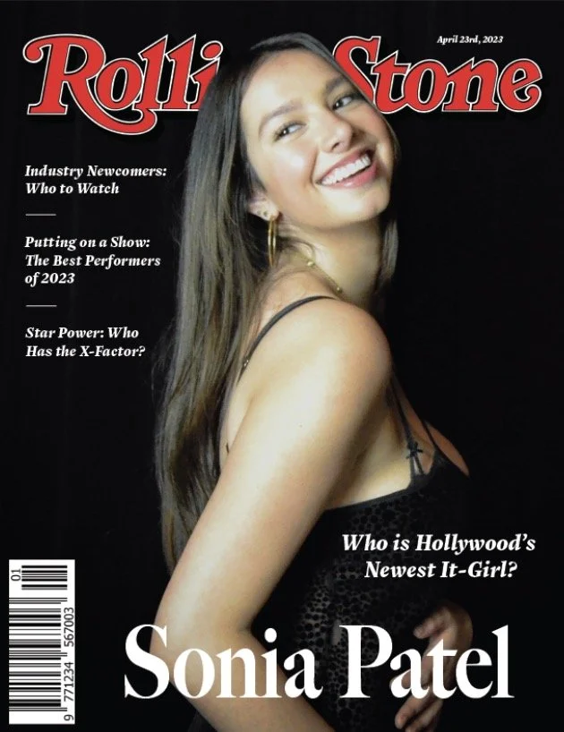
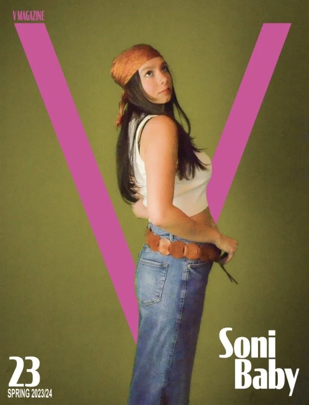
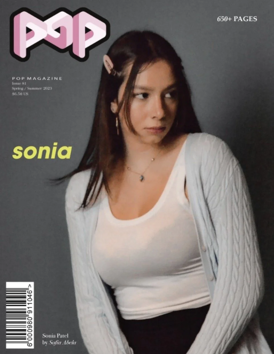
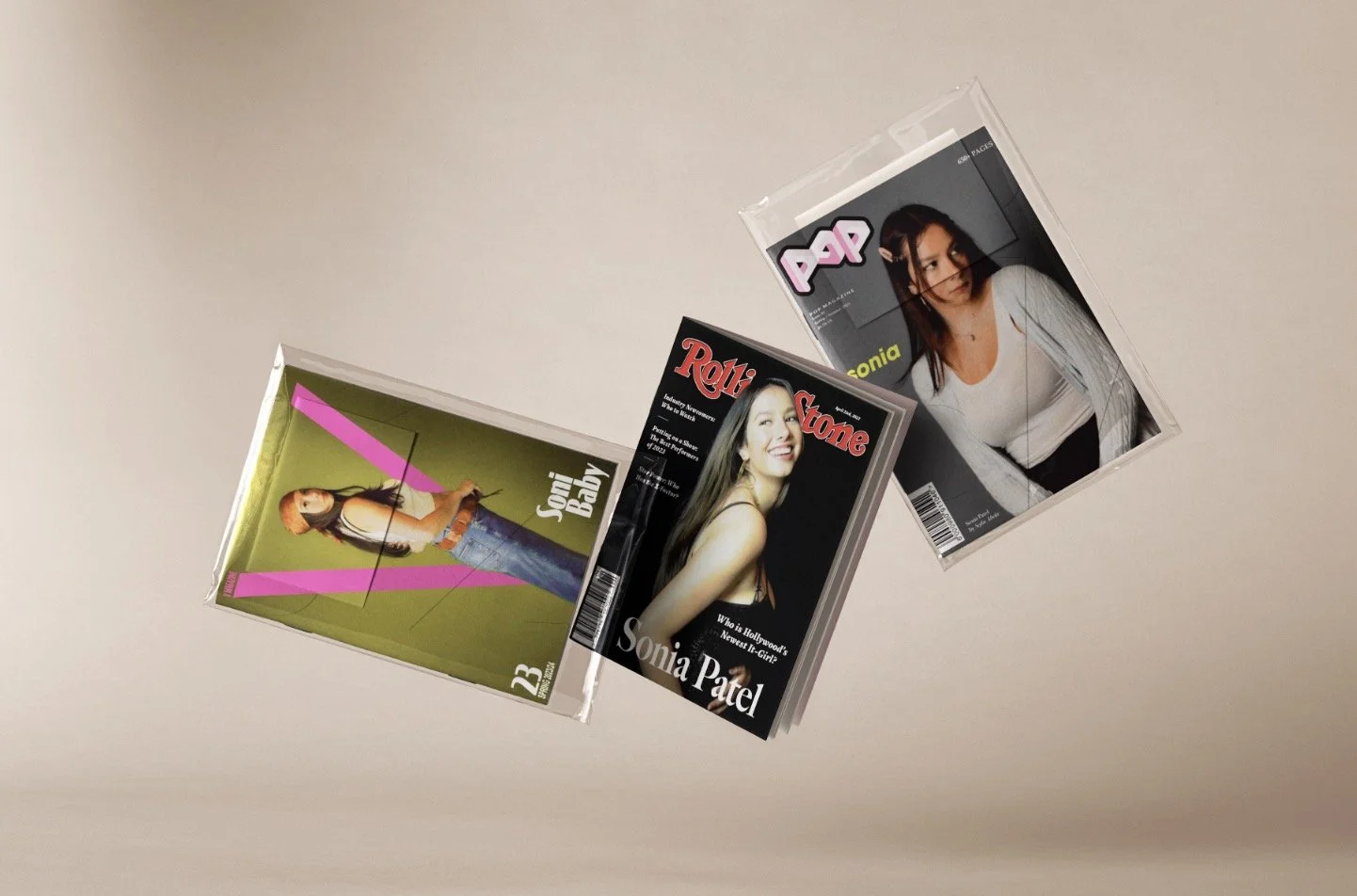
magazine covers
Photographed, styled, edited, and designed speculative magazine covers for existing publications, working within their existing visual identities.