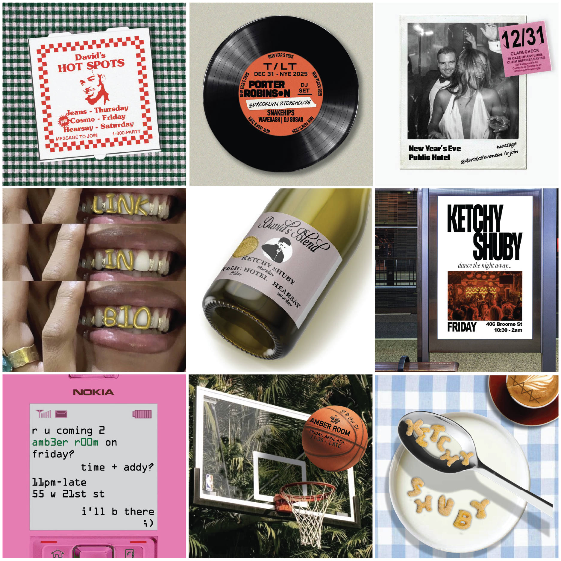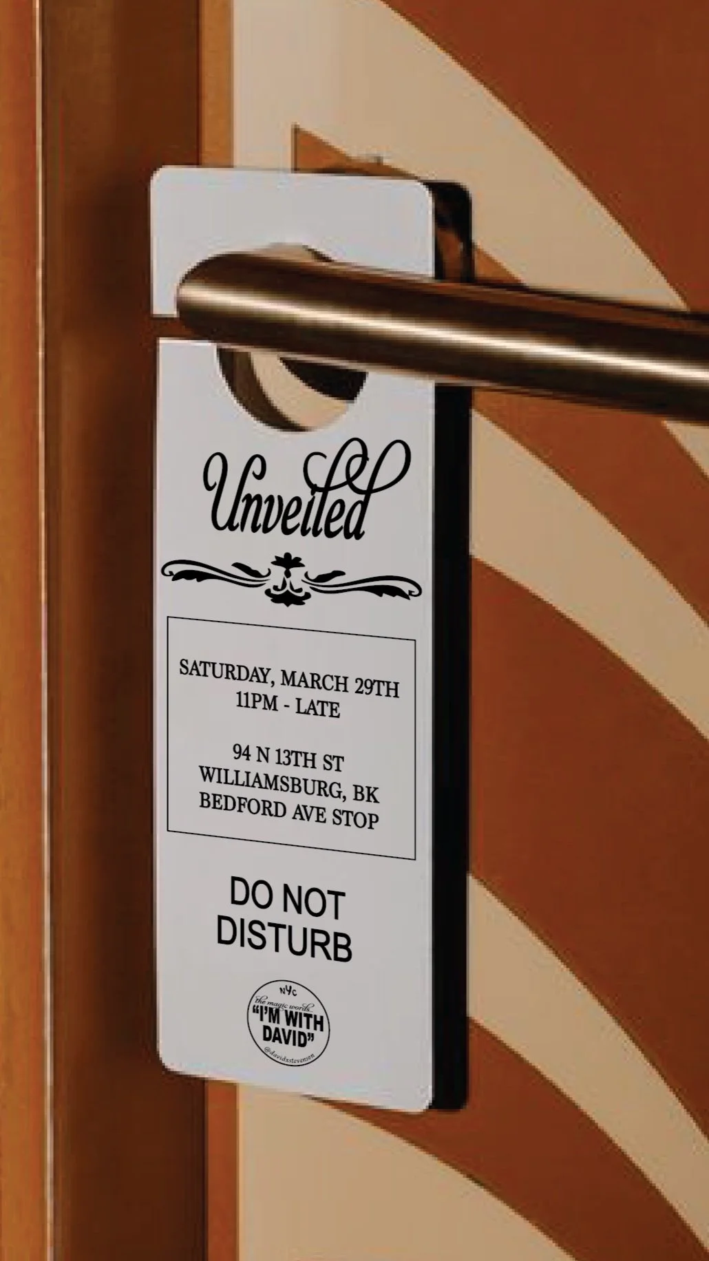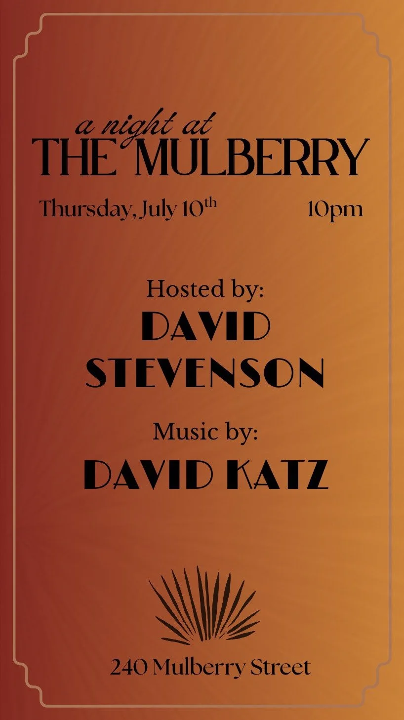
SOCIAL MEDIA FLYERS
I designed weekly nightlife flyers for a New York City event curator, adapting them across formats for Instagram feed posts, stories, and reels. Each version had a slightly different layout, but all shared the same goal: make a basic schedule feel engaging and worth looking at.
Most of the venue-provided flyers lacked visual appeal and didn’t reflect the actual vibe of the night. My designs aimed to either better represent the energy of the spaces or present repetitive information in a way that felt fresh and scroll-stopping. In some cases, the flyers helped capture the atmosphere; in others, they simply made routine info feel fun again.
The designs directly boosted engagement, with viewers messaging my client to compliment the visuals and asking for more details—proving that thoughtful design can drive real interest and attendance while creating a unique personal identity.